Polling
September 26, 2020
Polling: A Counterbalance to Fundamentals Forecasting
Given the dismal performance of last week’s fundamentals-only forecast, it is clear that, for this election, we will need something to compensate for such an outlier of an economy. Enter professional polling. It serves as a snapshot public opinion, and some pollsters are more renowned than others. That said, I wish to dedicate this blog post to the difficulties of weighting, and the methods that famous forecasters like FiveThirtyEight and The Economist use to comprehensively evaluate and utilize the plethora of polls and the wisdom of the masses.
Why Is Weighting Necessary?
Consider the following graph:
Poll Averages in the 2016 U.S. Presidential Election
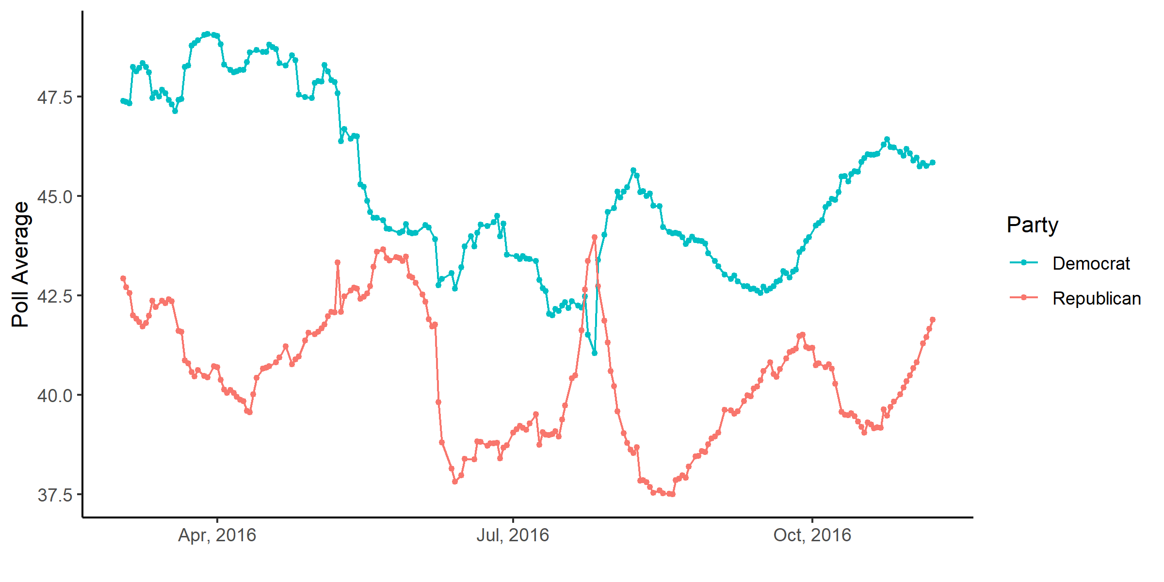
This graph shows the change in the average polling support for Hillary Clinton and Donald Trump over the course of the election. While taking the average of polls is industry standard, so as to naturally cancel out marginal errors between polls, these averages have a flaw that is worth devoting serious attention to: they treat every poll equally in the average. This ignores systematic errors relating to consistent methodological and/or house biases, like the mode of surveying (over-the-phone, email, internet survey), the sampling frame (likely voter lists, random-digit-dialing), and the sample size.
Luckily, FiveThirtyEight has a rigorous model for assessing the quality of various polling organizations. The assessment results in a letter grade ranging from A+ to D- (or an F if it’s truly atrocious). I made a bar graph showing the distribution for polls in 2016, weighted and filled based on a GPA/4 scale.
2016 Pollster Grade Distributions
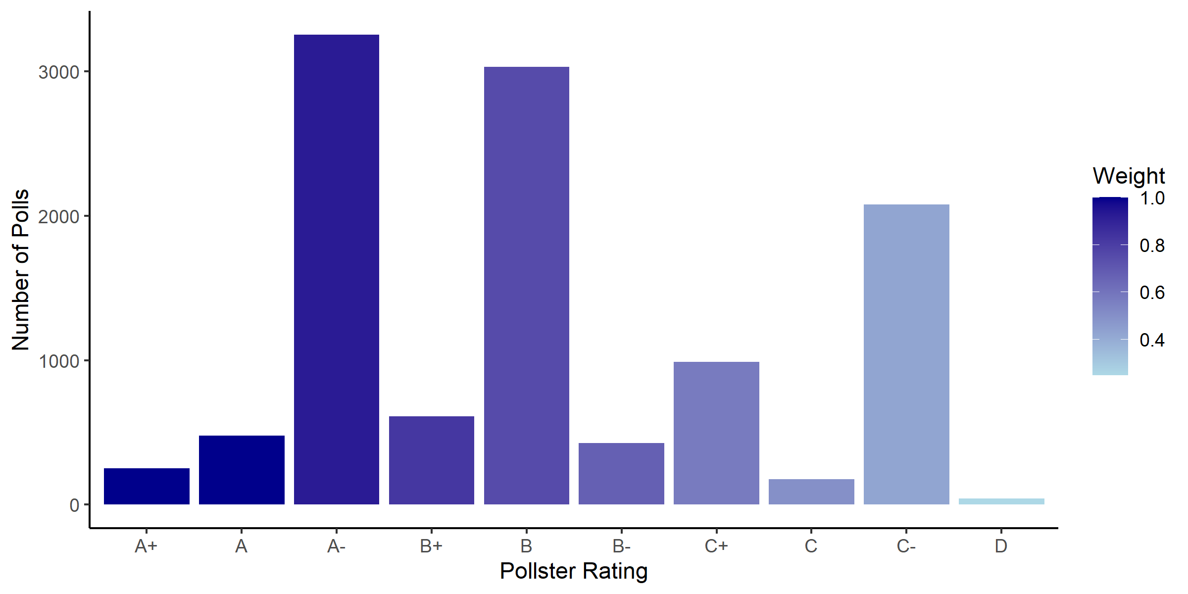
A few points stand out here.
- The overall poll quality is positively skewed. This is great, as more quality polls are representative in the dataset FiveThirtyEight is using.
- FiveThirtyEight uses polls all across the grade spectrum. And this is one of the main benefits of weighting, namely that Nate Silver and his team can even “C” graded polls because it will have an appropriate weight when the polls get aggregated. This allows a greater diversity of data points to greaten the accuracy of the final prediction.
I have created a similar graph for the purposes of 2020 predictions.
2020 Pollster Grade Distributions
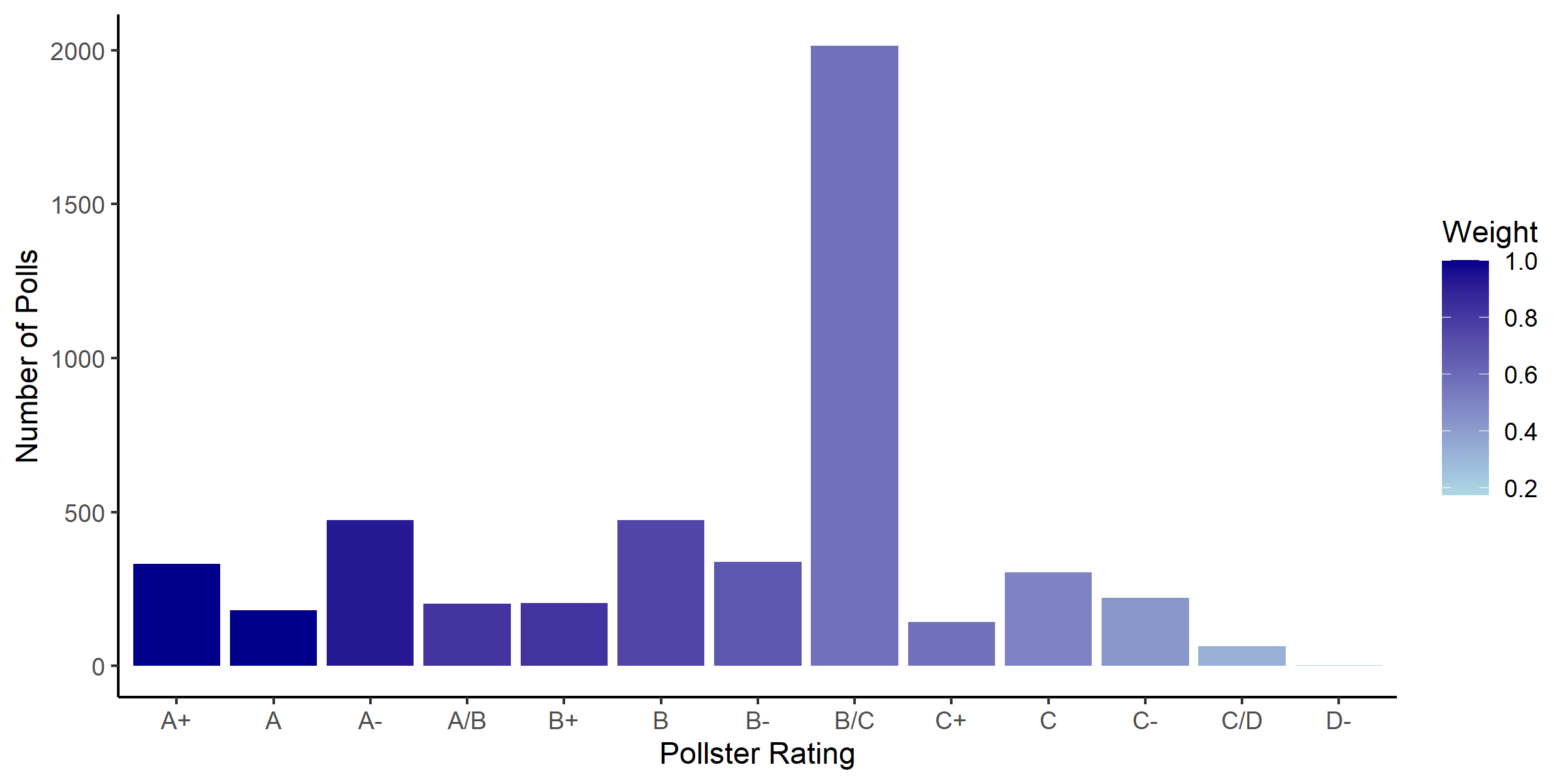
In contrast to the 2016 distribution, the median poll quality is much lower. As Silver points out in his methodology, those provisional grades are likely the result of many up and coming polling organizations that do not have enough of a track record to be properly evaluated. Nevertheless, even at a generous B, polling quality for 2020 suggests a lower degree of certainty relative to 2016 polls. I am thus cautious about working with them in my forecasting.
Predictions
I as well have an intuitive apprehension for relying too much on fundamentals data this election cycle, so for the time being I will be refraining from a “polls plus” model, and will instead focus on maximizing efficiency in non-fundamentals areas. This week, I worked towards a “polls only” model that would weight based on pollster quality on a GPA/4 scale. This scale turned out to be horribly naive, as it essentially halved all vote shares for either candidate. With a different method of computation, both candidates appeared to get 60% of the vote.
As I hope to have shown, weighting polls is very difficult, and where I have fallen short in my efforts to create a successful weighting paradigm, I have learned for my endeavors in future weeks.
Funny Stuff
- Good things come to those who weight.